
National Radio Website
Information architecture optimization
Reach Experience Design
Sep, 2021
Overview
In this project, through research methods such as user interviews, card sorting, and usability testing, we identified the importance of the educational broadcasting computer service to users and their usage habits.
We proposed a website information architecture design centered on user and organization purposes, which the client ultimately adopted and was officially released.
Background
The overwhelming information makes it difficult to find the desired services.
Educational Radio is one of the services provided by the Republic of China (Taiwan), which serves as an important channel for the government to convey a wide variety of information.
It not only disseminates a wide range of knowledge and information in areas such as education, art, science, and music through broadcasting, but also promotes cultural news, government announcements, and other content in written form.
However, there has been significant feedback indicating that users find the information on the landing page is too overwhelming or have difficulty locating the programs or information they wish.
Project Goal
Understand user needs and difficulties.
Identify the importance of each service.
Create a web architecture that aligns with
user needs.
Project Time Line
Reorganize the information architecture based on user needs.
User Research
3 weeks
-
User Interview
-
Card sorting
-
Usability testing
UX Design
2 weeks
-
Website Architecture design
My Role: User Research / UX Design
Tools: miro(card sorting), whimsical(lofi-prototype)
Research Method
Gain an in-depth understanding of usage patterns,
identify service categories and values.
In this project, we recruited six participants, including users aged from 20 to 60, to conduct the following studies:
1. Pre-User Interview: Understand Past Using Experience
In the initial interview phase, we focused on understanding participants' past usage habits and conditions, including usage frequency, features used, and problems encountered.
2. Card Sorting: Reorganize & Identify the Key Service
The Educational Radio website contains around 30 different types of information, resulting in user confusion due to the diverse range of services.
Therefore, we employed card sorting to reclassify the information, calculate and prioritize its importance to the users. This helped us create clearer categorization principles and a more straightforward way of presenting.

3. Usability Testing: Discover the Pain Points of Using
In the usability testing phase, we designed 11 tasks encompassing the main services of the Educational Radio Station. This allowed us to gain a deep understanding of the issues users encounter when searching for information and using.
Partial of the Testing record

Research Insight
Problem Discover, Define, and propose Design suggestions
in each area of the website landing page.
Overall services
Re-organize the information architecture,
and prioritize the importance through user view.
According to the results of the card sorting and usability test, we found that most of the users cannot understand the classification rules and meanings of more than 30 current services. Therefore we reclassified the services and also calculated the importance of each service to users.

Card Sorting Record
Prioritize
Re-organize


The number in the red circle indicates the importance to users (1=most important; 6=least important).
Overall services
Segment the Information Structure of the Homepage
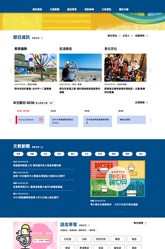
The home page was composed of multiple modules, each module representing a different service. To conduct a detailed analysis of each service block, we first divided it into 9 major areas, namely the Player, Website navigation, Program information, Educational news, Language learning, Public service, Events' photos, Radio announcements, and Other platforms.


Each service
Problem Discover, Define,
and thus Develop Design suggestions.

Problem Discovery
1
2
Don’t know that pressing the program name will play it
Player not found, unable to pause
Problem Define
The player is not presented clearly so that the operation method cannot be found or misunderstood.
Design Direction Suggestion
Operation methods and functional placements should align with users' habits to reduce learning costs.


Operation methods and functional placements should align with users' habits to reduce learning costs.
Guiding users to explore the website and easy-to-find commonly used functions.
Convey the meaning of titles and their corresponding content correctly.
Make titles and content more readable and relevant, and strengthen the similarity of the same item.
Clearly differentiate between item levels, classification rules, and information sources.
Enhance the relevance of titles and content, and distribute information based on user needs.
Select key content to reduce user browsing burden.
Clearly differentiate between different websites and content.
3 Key Direction of the Web Landing Page Design
1
Convey the meaning of titles and their corresponding content correctly.
2
The distribution of information importance should align with user usage and browsing habits.
3
Guiding users to explore more.
Design Suggestion
Restructure and Re-arrange the services and landing page
Overall Services
Rearrange information according to
classification and importance to the user
According to the results of card sorting, users mainly classify information into the following categories (ordered from high to low importance): Program information, Other platforms, Language learning, Educational news, Event participation, and Station information.
*Among "Other platforms", the social platform and Channel+ platform are the most valued by users.


High Importance
Low Importance
Each Service | Navigation & Social Platform
Guiding users to explore the website and easy-to-find commonly used functions.
Before


Problem Define
The information is confusing and the icons are not intuitive, making it difficult to search.

1
2
1
Build a fixed top navigation bar to help users quickly find the services they need.
2
Fix commonly used social platforms on the screen with icons, which not only saves the space of the screen but is also convenient to use.
Each Service | Radio Player & Program Information
Convey titles' meaning and corresponding content correctly, and align with user audio playing habit.
Before

Problem Define | Radio Player
The player is not presented clearly so that the function cannot be found or misunderstood.
Problem Define | Program Info
1. The names of various information are similar, making it difficult to distinguish.
2. Component visuals differ from what users are familiar with.

1
1
2
3
4
5
1
Change "Program Overview" to "View All" and "Program Preview" to "Program News" to reduce user misunderstandings.
2
Shows the category and show or episode for users to preview and thus strengthen the link to “Program”.
3
Changing the "Program schedule" to "Recent Broadcasts" and displaying the date can make a strong connection with timeliness.
4
Present the currently playing program in a special color, and add the words "on air" or "live" to make it more eye-catching.
5
When playing, the player will appear and be fixed at the bottom of the page, making it more convenient to operate and align with the current related services, such as spotify, kkbox, etc.
Each Service | Other Platform
Clearly differentiate between different websites and content.

Problem Define
1. The project title does not allow people to understand the content.
2. The visual style of components is the same as other functions, making it difficult to distinguish the differences between platforms.

1
2
3
1
Change the title to "Selected Programs" and add description text to reduce confusion.
2
Present "Go to Channel+ website" to let users know that it's another website.
3
Launching C+ promotion projects in this area not only increases the sense of belonging but also achieves publicity effects.
Each Service | Language Learning
Clearly differentiate between item levels, classification rules, and information sources.
Before

Problem Define
1. The visual style of the main title and the subtitle are so similar that users cannot distinguish the relationship between the two.
2. Not understanding the classification and the content previewing rules.

1
2
3
2
1
Add an explanatory to help users understand that this is a language-learning file storage area.
2
List all language categories, allowing users to select the desired items and present them on the left to preview.
3
Place less using materials below to reduce visual interference.
Each Service | Educational News
Make titles and content more readable and relevant, and strengthen the similarity of the same item.
Before

Problem Define
1. The size difference between the text and the image is so high and the contrast is so low that it is difficult to notice the text and recognize the title.
2. Similar information is presented differently, causing people to misunderstand the meaning.
3. The project name makes it easy to misunderstand the content.

1
3
2
1
2
3
Display categories in the layout to increase visibility (click to go to the category).
Widen the left area and add pictures to balance the information to clarify that they are the same type of information.
Shrink the right area and add a mask under the text to make the news title text more visible.
Each Service | Event Participation
Enhance the relevance of titles and content, and distribute information based on user needs.
Before

Problem Define
1. The project title is imprecise and thus difficult to identify the content.
2. Overloading too many unused functions makes information overwhelming and interferes with usability.

1
3
2
1
2
3
Delete rarely used features, merge similar content, and change the title to "Event Participation" to make it clearer.
Reduce image size to reduce visual interference
Add descriptions to allow users to better understand the differences.
Each Service | Station Information
Select key content to reduce user browsing burden.
Before

Problem Define
Overloading too many unused functions makes information overwhelming and interferes with usability.

1
1
Leave key messages and delete rarely used information for users to reduce visual interference.
Appendix | Recategorize website information
Based on the findings, we recommend changing the classification to that shown below on the right.


Project Outcome
In this project, we conducted interviews, card sorting, and usability test to comprehensively understand the information structure and usage issues, shape the design direction, and then propose a completely new web information structure organization plan.
The owner is very impressed by the results of this project, and it has now been successfully adopted and officially launched.
Personal Reflection
Further enhanced by establishing the design guidelines.
In this project, we utilized user research insights to propose comprehensive design recommendations for the website's information and structure, achieving significant success.
However, if we have more time for further enhancement, I believe we could reference additional competitors or design guidelines to establish the design guidelines of the National Radio Website. This could include unifying the visual styles of functional elements and standardizing font sizes for headings and body text, making the interface more intuitive and the layout cleaner.